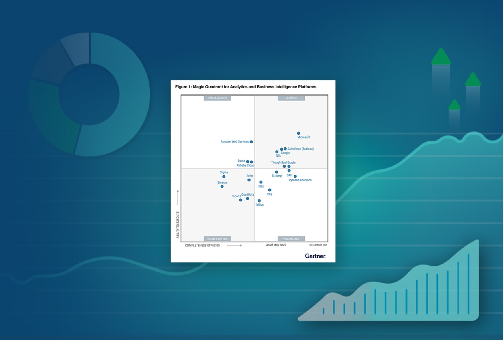
Data Visualization Tools

2022 reviews of top data visualization software. This guide provides an in-depth comparison of the top data visualization software and offers practical advice to help you select the right solution for your organization.

Business Intelligence tools: Power BI vs Qlik vs Tableau

What Are Data Visualization Tools?

Data visualization tools allow users to easily create graphics and imagery that help them make sense out of large amounts of data. Graphs, maps and charts allow them to quickly see trends, recognize relationships and uncover outliers in their data. The result is more informed decision-making, which can increase efficiency, revenue and profits.

Data Visualization Tools – Compare The 3 Gartner Leaders

In their 2023 Magic Quadrant Analytics & BI report, Gartner named only three vendors as Leaders: Qlik, Power BI and Tableau. That’s because interactive data visualization at scale requires a suite of supporting capabilities that only the very best tools deliver.

1. Data Visualization

Most tools can visualize data in graphs, charts and maps. Modern tools make these visualizations interactive, and some offer AI to assist in chart creation, pinpoint outliers, and suggest new visuals. The best tools allow you to freely explore all your data, in any direction, directly from within the visualization.

Laptop showing Qlik's interactive dashboards on the monitor

Qlik Sense

Tableau

Power BI

2. Dashboard Exploration

Most data visualization tools can also create cool-looking dashboards. Unfortunately, most tools are traditional, query-based platforms which limit your exploration to predetermined paths. Your tool should allow end-users to explore their data freely, in any direction and to use data from unlimited sources.

Diagram depicting a modern associative model versus an old school linear BI

Qlik Sense

Tableau

Power BI

10 Ways to Take Your Visualizations to the Next Level

Inspire action with your data. Learn about the latest visualizations and how to choose the right ones to highlight the most important aspects of your data.

3. AI-Powered Recommendations

The best data visualization tools help you get better insights faster. With the power of AI and machine learning, augmented analytics helps you quickly analyze your data from angles you may not have considered. This helps you increase productivity and make better decisions.

Screenshot of a dashboard showing how augmented analytics can make suggestions for your data based on searched terms

Qlik Sense

Tableau

Power BI

4. Fully Functional Mobile Experience

Users should be able to create rich data visualizations and fully analyze their data at any time, on any device they choose. The best data visualization tools provide a fully functional mobile app that empowers users to deeply explore data and generate insights wherever they are.

Image of a laptop and mobile phone showing graphs and charts

Qlik Sense

Tableau

Power BI

5. Scalability

To get the most valuable insights, you need a complete view of all your datasets, large and small. That means bringing data together from multiple sources in near real time. Be sure your data visualization platform can handle large amounts of data without increasing cost or degrading performance.

Bar chart depicting increased users, data scale, and analytic complexity

Qlik Sense

Tableau

Power BI

6. Embedding Visualizations

With embedded analytics, employees, partners, customers and suppliers can visualize and analyze data using their everyday applications. Also known as OEM or white label analytics, embedded analytics helps users make better decisions faster by making insights available in portals and processes. Big data visualization tools should embed analytics functionality across the enterprise by providing open APIs and an extensible platform.

Screenshot demonstrating Qlik's embedded analytics capabilities.

Qlik Sense

Tableau

Power BI

BARC’s BI & Analytics Survey 23: Qlik Highlights

In BARC’s survey of real BI users, Qlik Sense ranked #1 in critical KPIs including Performance Satisfaction, Dashboards, and Project Length in its peer groups.

7. Deployment Flexibility

The best data visualization tools allow you to deploy your data any way you choose—regardless of platform or cloud architecture. Steer clear of solutions that lock in your data, restrict your cloud analytics strategy or require new infrastructure.

Diagram depicting flexible deployment options from cloud services, public/private cloud, and on-premises

Qlik Sense

Tableau

Power BI

8. Governed Self-Service

Trusting your data while also allowing many users to generate their own insights is a tricky balance. The best data visualization tools allow you to securely manage your data in a centralized way using rules-based governance. At the same time, they also give users access to self-service analytics so they can explore their data without calling on IT or an analyst for help.

Image showing a woman standing inside a bar chart looking at line graphs above her

Qlik Sense

Tableau

Power BI

9. Single Platform for Many Use Cases

A modern data visualization platform should allow many different types of users, such as analysts, engineers and businesspeople to use the same platform and data to perform many different use cases—like exploring data, embedding analytics, or creating interactive dashboards.

Diagram depicting all use cases versus one use case

Qlik Sense

Tableau

Power BI

10. Data Integration

The most vivid images in the world mean nothing if you don’t start with the right data. Effective visualization tools integrate data from across the enterprise and provide business users with a data catalog that makes it easier for them to find what they need—no matter what their skill level.

Diagram showing how data is processed into the Governed Data Catalog and BI Applications.

Qlik Sense

Tableau

Power BI

BONUS FEATURE: Supporting Data Literacy

The best big data visualization tools go beyond just teaching people how to use their platform. Instead, users should learn how to be data literate, helping them understand how to analyze and communicate with visual data.

A group of men and women around a table discussing prints of charts and graphs

Qlik Sense

Tableau

Power BI

How to Design Best-in-Class Dashboards - Image

How to Design Best-in-Class Dashboards

Download our ebook with 4 must-see dashboard examples.

Total Cost of Ownership

Your data visualization software should provide full transparency into total cost of ownership.

Total cost of ownership (TCO) covers more than just the cost of software. It also covers costs over a 3- to 5-year period, including systems setup and development, infrastructure, and systems admin and support. Be sure your data visualization tools vendor discloses the total financial and time commitment required to use their platform.

A line graph showing the total cost of ownership between Qlik Sense and Power BI over a 3-year period

Qlik Sense

Tableau

Power BI

Cheers to 13 years!

Qlik has been named a Leader in the Gartner® Magic Quadrant™ for Analytics and Business Intelligence Platforms for the 13th year in a row.

See Interactive Dashboards in Action