Integrate, transform, analyze, and act on data
Drive real results with governed AI, quality data, and trusted insights.
Integrations & Connectors
Connect and combine data from hundreds of sources
Featured Technology Partners
AWS
Google
Microsoft
Snowflake
SAP
Databricks
Cloudera
Deliver trusted data across your organization, so you move faster on data driven projects, make smarter decisions, and run more efficiently.
Core Capabilities
Pricing
Try for Free
Data Sources and Targets
Access and integrate the data you need to deliver greater business outcomes
Qlik Services
Qlik Roadmap
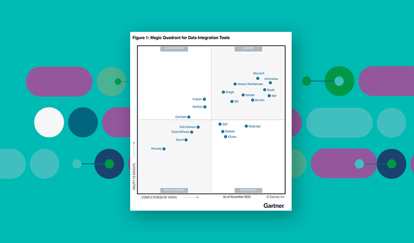
2025 Gartner® Magic Quadrant™ for Data Integration Tools
Inform every decision through AI-powered insight
Data Sources
Connect and combine data from hundreds of sources to fuel your ever-evolving analytics needs
Give clear insights from data and content to make decisions, streamline work, and take action.
All Analytics & AI Products
Qlik Cloud Analytics®
All the power of Qlik analytics solutions in a cloud-based SaaS deployment
Qlik Sense® (On-prem)
Seamless integration of data from multiple systems
Qlik Answers®
GenAI-driven answers from unstructured content
Qlik Automate™
Automatically trigger informed action on most SaaS applications
Qlik Predict™
Forecast business trends and act faster with explainable predictive AI
All Data Integration and Quality Products
Qlik Talend® Cloud
Get a trusted data foundation to power your AI, ML, and analytics
Talend® Data Fabric
Unify, integrate, and govern disparate data environments
Qlik Compose® for Data Lakes
Automate your data pipelines to create analytics-ready data sets
Qlik Compose for Data Warehouses
Automate the entire data warehouse lifecycle
Talend Data Catalog
Understand the data flowing through your analytics pipelines
Qlik Enterprise Manager®
Centrally configure, execute, and monitor replication and transformation
Qlik Replicate®
Accelerate data replication, ingestion, and streaming.
Qlik Gold Client®
Improve data management in your non-production SAP environments
ISV
Financial Services
Manufacturing
Healthcare
Consumer Products
Public Sector
Energy Utilities
US Government
High Tech
Retail
Life Sciences
Communications
Sales
Product Intelligence
Marketing
HR & People
Finance
IT
Operations
Get the help you need to make your data work harder
Transform IT services, solution development, and delivery
A Century-Old Institution Reaps the Business Benefits of Data Warehouse Modernization and Integration
Making AI Real for Customers with Robust Data Foundations and Powerful AI-Driven Insight
Hitting the Ground Running with Generative AI
AI-Ready Data
Accurate, accessible and trustworthy data for AI success
Artificial Intelligence
Act on insights with AI-powered analytics
Data Management
Collect, store, organize, and maintain data
AutoML
Bring automated machine learning to analytics teams
Data Products
Solve domain-specific business outcomes
Data Fabric
Data Quality
Discover, manage, enhance, and regulate data
Data Catalog
Find the data you need and evaluate its fitness for your use case
Data Visualization
Make it easier to see trends and relationships in your data
Data Governance
Ensure data is trustworthy and consistent
iPaaS
Integrate applications and data sources
Data Literacy
Read, work with, analyze, and communicate with data
Predictive Analytics
Predict future outcomes based on historical and current data
REEDS Enables Easy Access to Data to Triple Digital Revenues
Transbank Harnesses the Cloud and GenAI To Build Unique Offerings
Palladium Hotel Group Mines Data To Drive Customer-Centricity
Like our keynote speaker, find your different at Qlik Connect!
AWS re:Invent
Qlik Product Recap: 2025 Innovations
Customer Stories
More than 40,000 customers find answers with Qlik.
Analyst Reports
Read analyst reports for data integration and analytics.
Whitepapers & eBooks
Visit the Qlik Resource Library.
Webinars
Visit the Qlik Webinar Library.
Videos
Visit the Qlik Video Library.
Datasheets & Brochures
Visit the Qlik Datasheet and Brochure Library.
AI analytics refers to the use of machine learning to automate processes, analyze data, derive insights, and make predictions or recommendations.
Business Intelligence
Data Analytics
Data Mining
Data Warehouse
Embedded Analytics
Predictive Modeling
Community Overview
Welcome to the Qlik Community
Qlik Gallery
Get inspired by recent Qlik apps and discuss impacts with peers
Support
Get support directly from a community of experts
Greenway
Plot your path of engagement with Qlik
Ideation
Vote for your favorite product ideas and suggest your own
Training Overview
World-class resources to adopt Qlik products and improve data literacy.
Instructor-Led Learning
Get interactive, hands-on learning with Qlik experts
Free Training
FREE courses and help, from basic to advanced
Literacy Program
Understand, analyze, and use data with confidence.
Self-Paced Learning
Get hundreds of self-paced training courses
Validate Your Skills
Validate knowledge and skills in Qlik products, analytics, and data literacy
Qlik and Talend Certification
Boost your data integration and analytics skills
Data Integration and Quality Pricing
Rapidly deliver trusted data to drive smarter decisions with the right data integration plan.
Analytics Pricing
Deliver better insights and outcomes with the right analytics plan.
AI/ML Pricing
Build and deploy predictive AI apps with a no-code experience.
Qlik Open Lakehouse: Now Generally Available
From Data to DNA: Qlik and AWS at the Core of Intelligent Decision-Making
An Open Letter to Informatica Customers
 Jessica DuBois