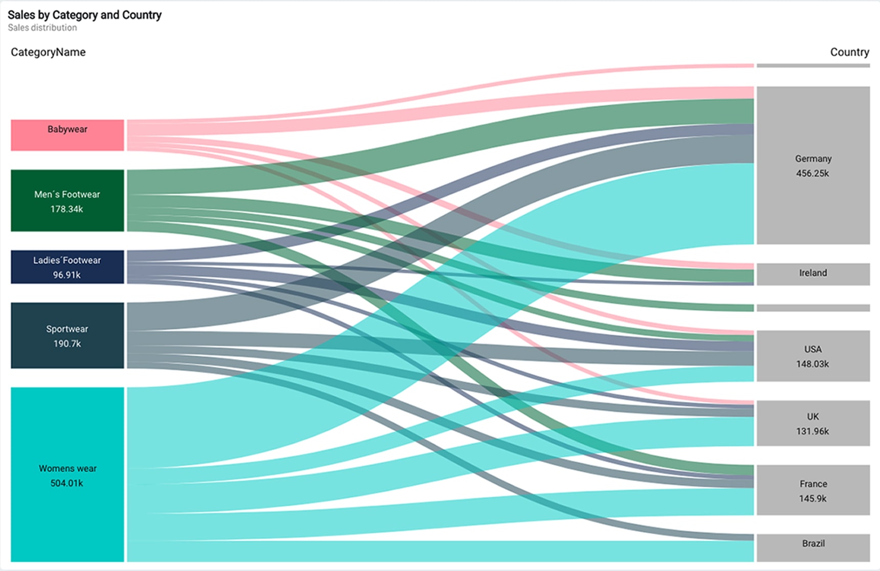
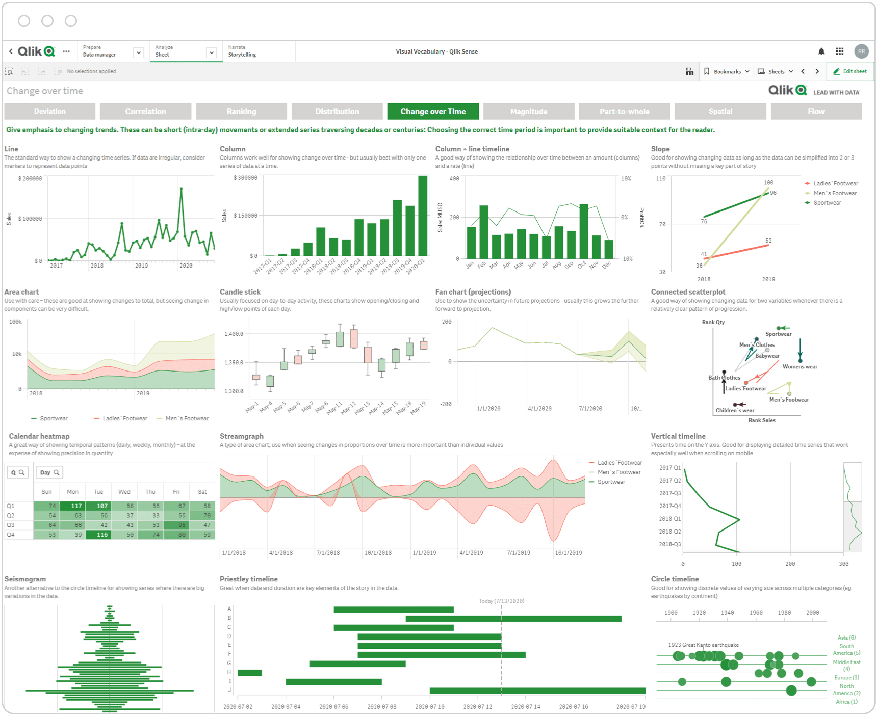
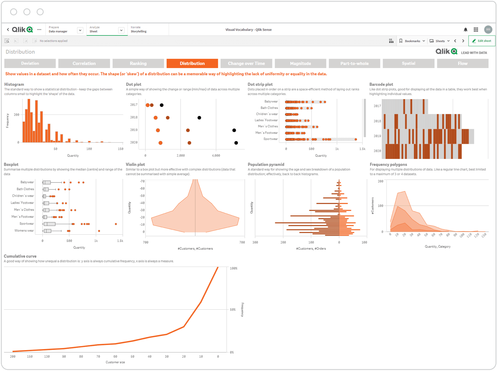
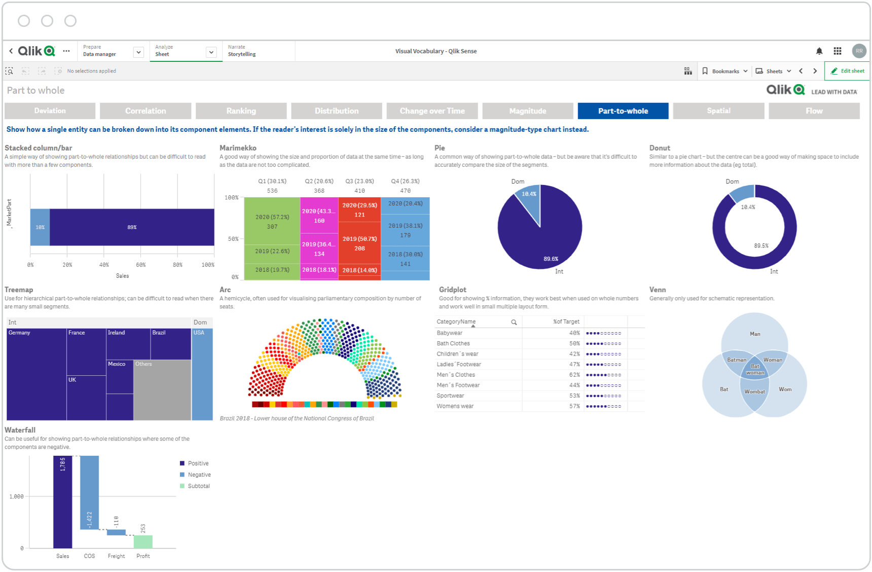
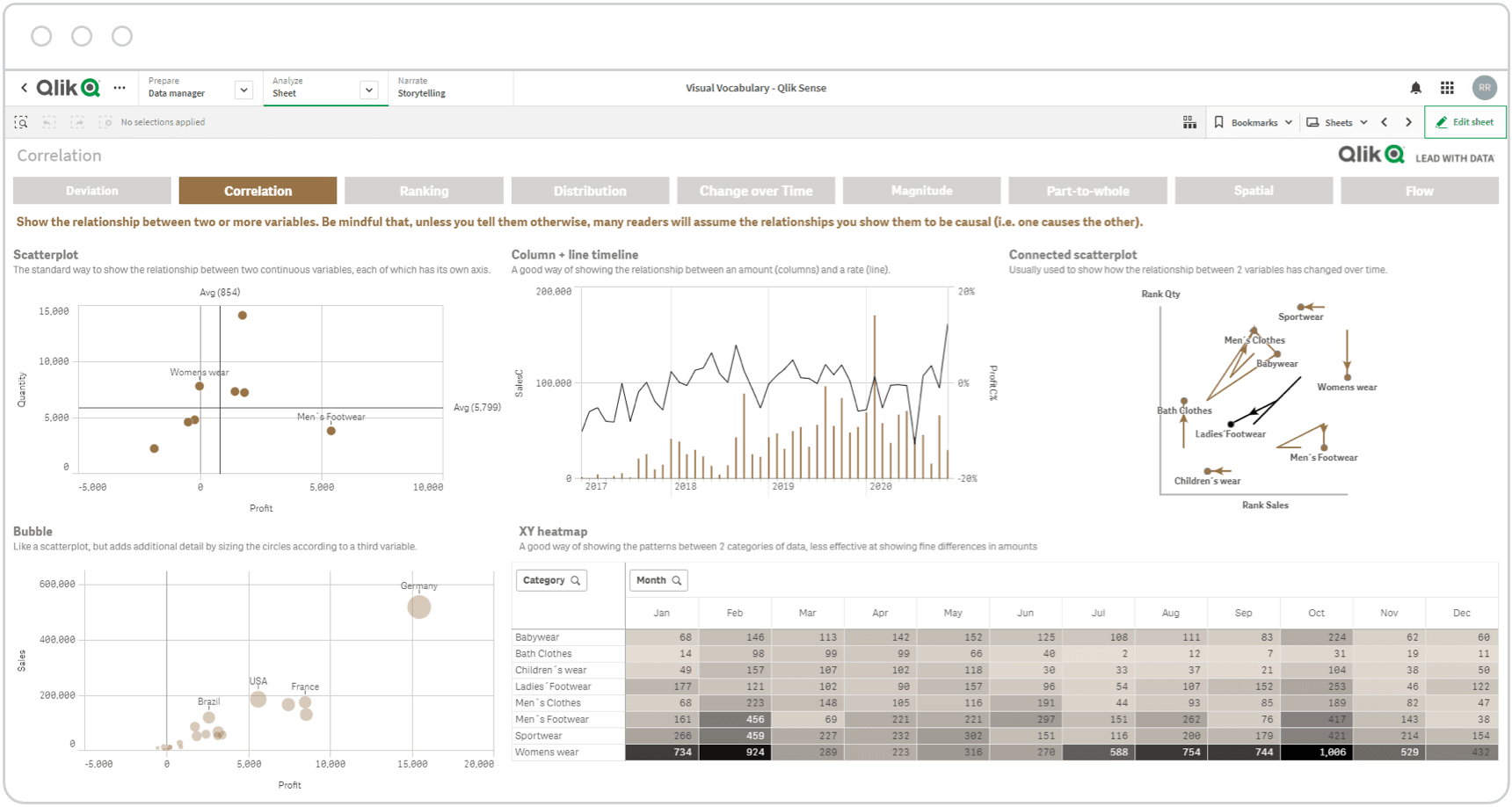
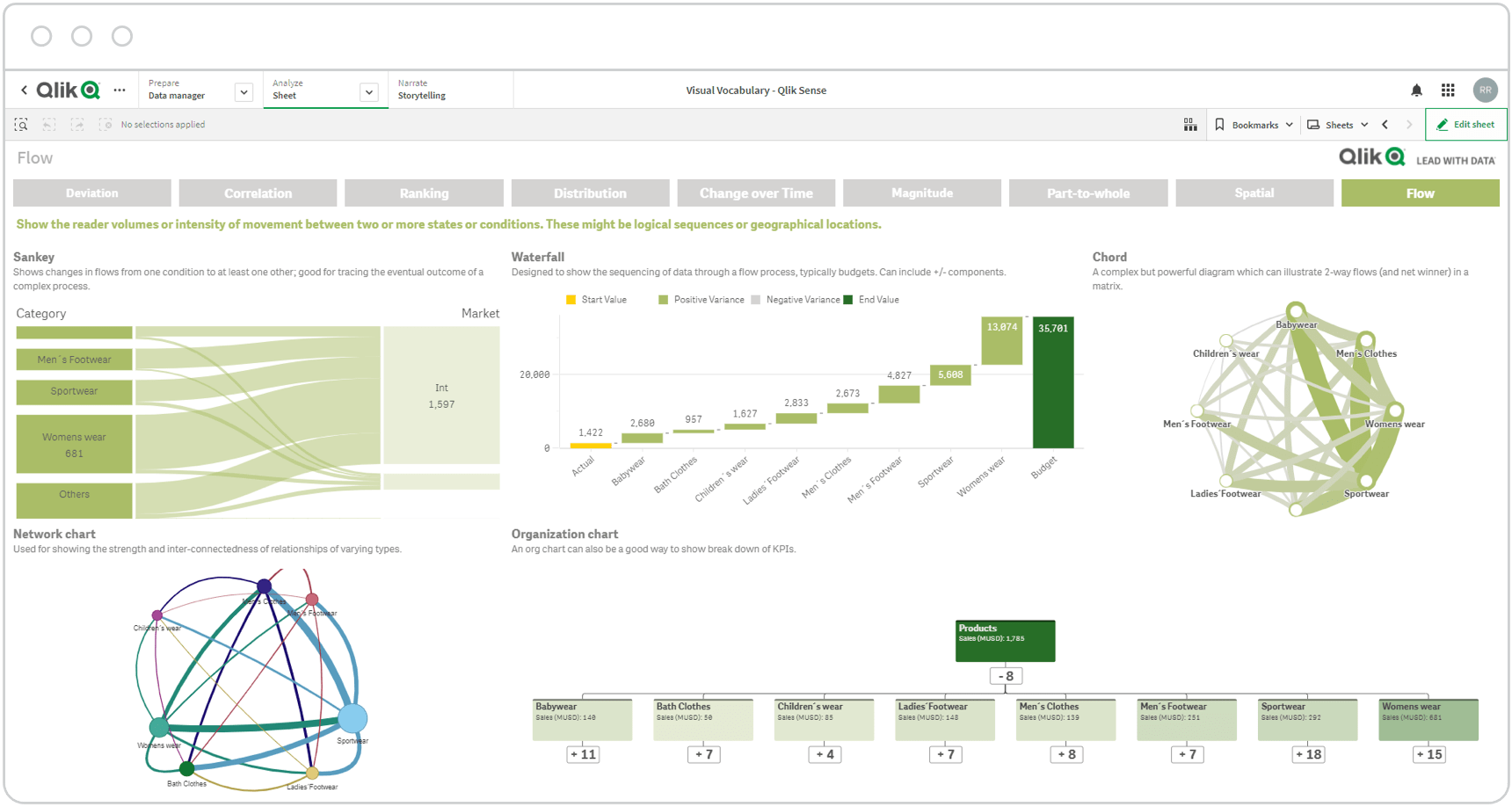
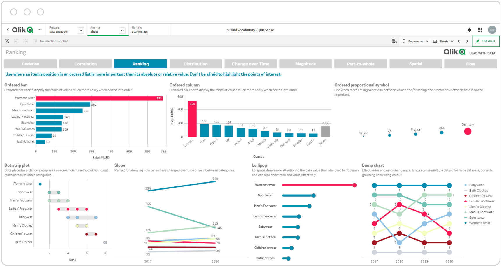
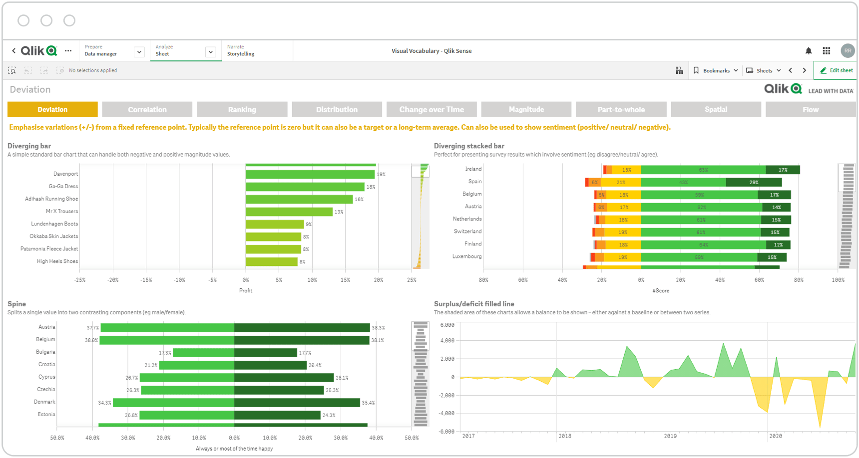
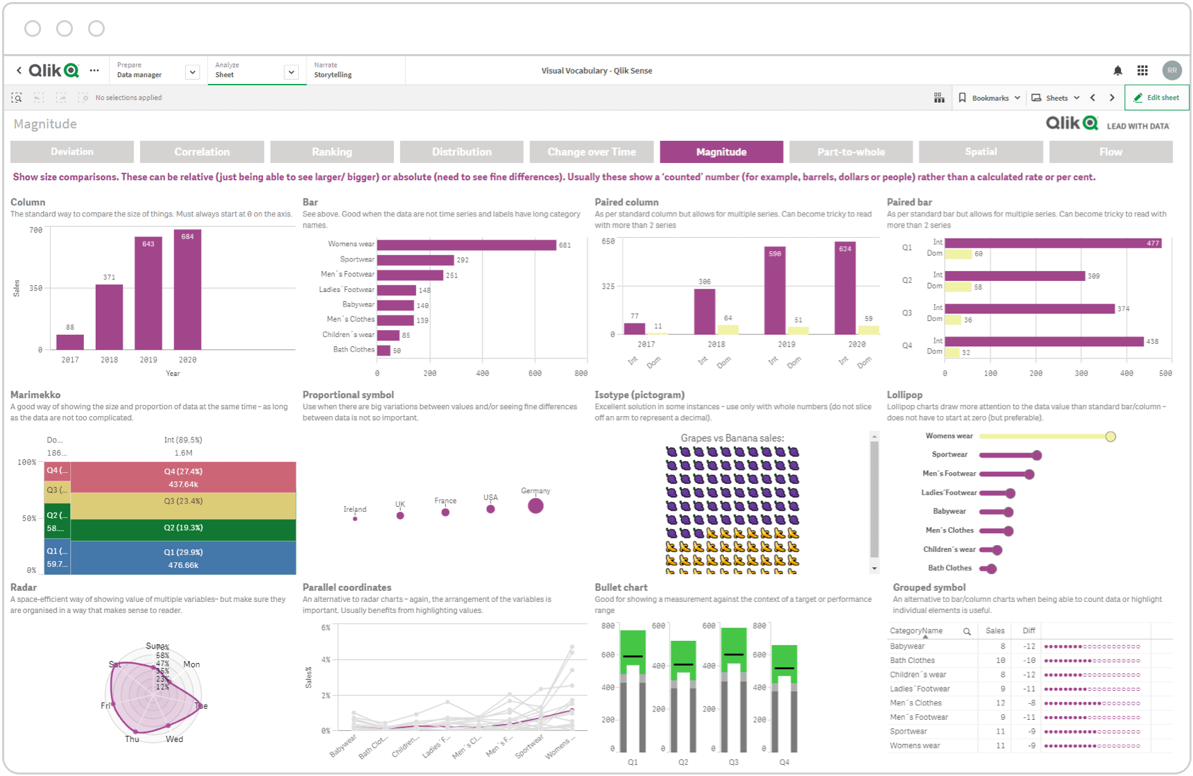
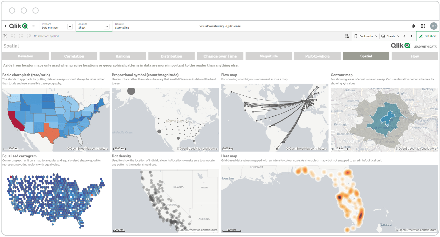
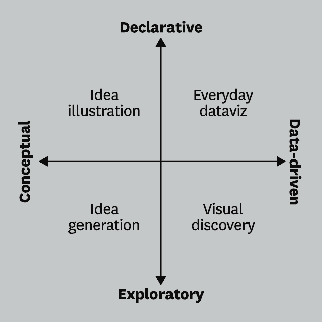
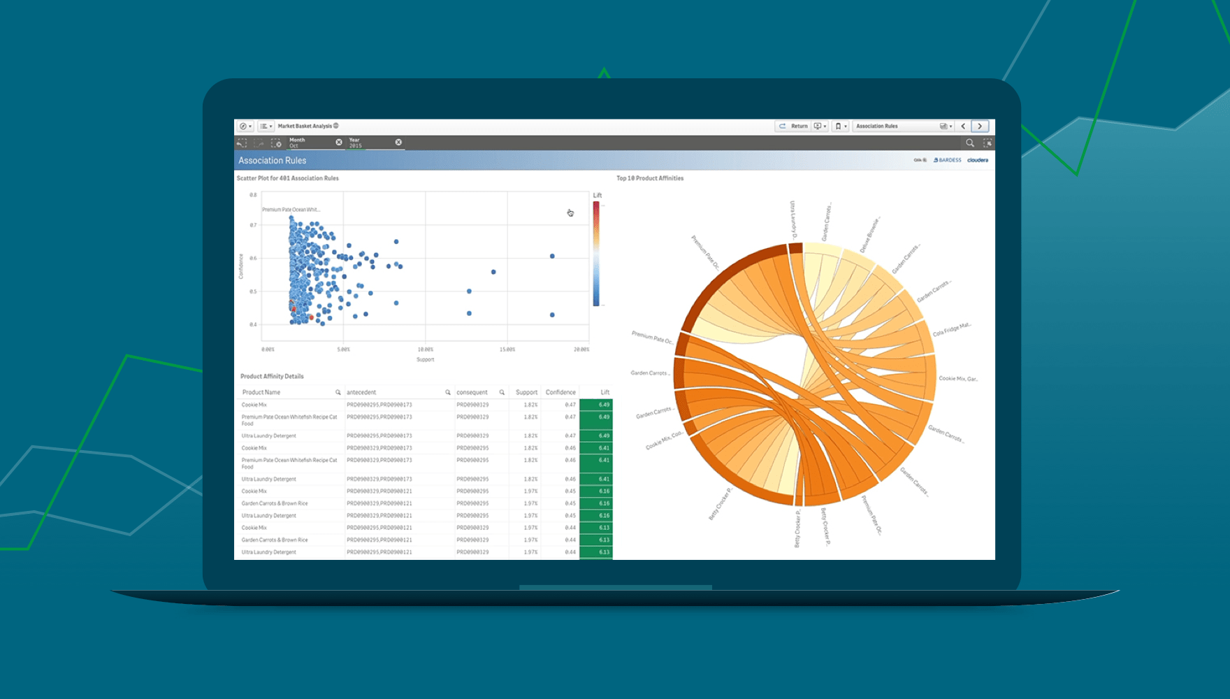
The five main forms of visualizing data are:
1. Charts and Graphs: This includes bar charts, line charts, pie charts, and other graphical representations that display numerical data.
2. Maps: Geographic data can be visualized using maps, highlighting spatial patterns and relationships.
3. Tables: Tabular presentations of data provide a structured format for easy comparison and reference.
4. Infographics: Visual representations combining charts, icons, and text to convey information in a more engaging and digestible manner.
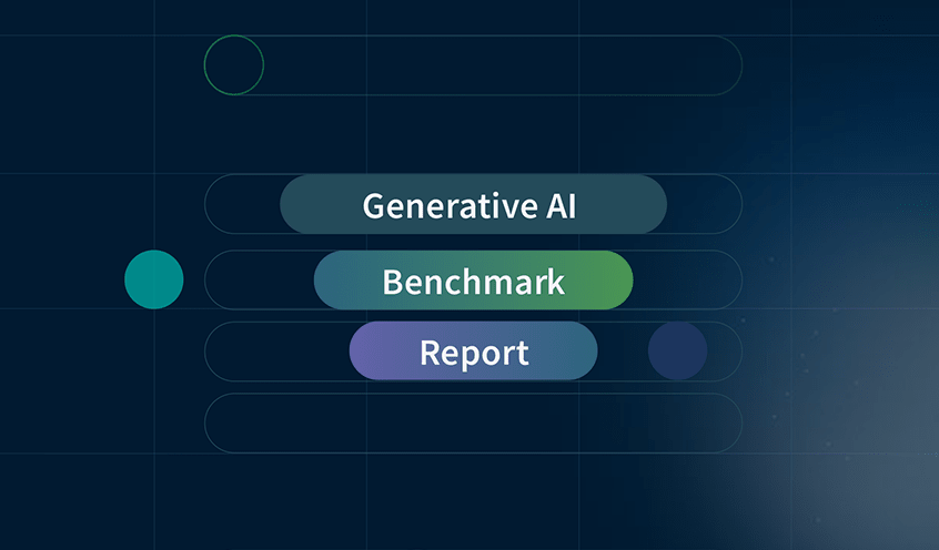
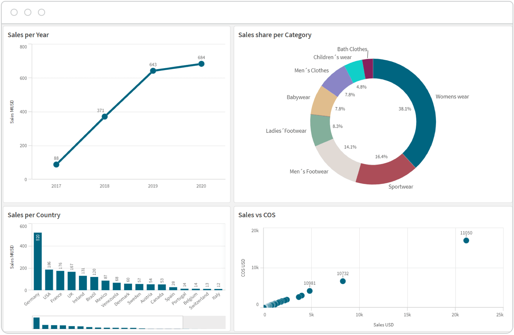
5. Dashboards: Interactive displays that combine various visual elements to provide a comprehensive overview of data, often used for monitoring and analysis.
To learn data visualization, grasp fundamental statistics and design principles. If you have data science skills, explore popular tools like Python with Matplotlib or R with ggplot2. Or, modern analytics tools simplify the process, offering user-friendly interfaces and extensive resources. You can also utilize online courses like Coursera, Udacity, or Khan Academy for theory and hands-on practice.
Visualizing data is crucial as it transforms intricate datasets into clear visuals, facilitating easier comprehension and decision-making. Visualizations efficiently convey insights, patterns, and trends, leveraging your brain's ability to process visual information. They enhance communication, aid in identifying correlations and outliers, and empower you and your organization to derive meaningful insights from complex datasets. In fields like business, science, and public policy, the skill of presenting data visually has become fundamental, driving informed decision-making and fostering a deeper understanding of complex information.
Data visualization and data analysis are distinct yet interconnected processes in the realm of data interpretation. Data analysis involves the systematic examination of datasets to discover patterns, relationships, and insights. It encompasses statistical methods, machine learning, and other analytical techniques to extract meaningful information. On the other hand, visualizing data focuses on presenting the results of data analysis in a visual format, using charts, graphs, and dashboards to communicate complex findings effectively. While data analysis involves the exploration and interpretation of raw data, data viz transforms these findings into visually accessible representations, enhancing understanding and decision-making. Both are integral components of the data-driven decision-making process.