VISUALIZATION TOOL FOR BIG DATA
Deliver Faster, Smarter Decisions with Qlik
Uncover insights with powerful visualization tools designed for big data. Build interactive dashboards, analyze large datasets, and empower smarter decisions with visual analytics at scale.
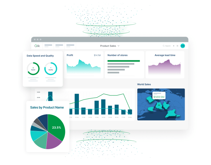
Power every decision with scalable visual analytics for massive datasets
Transform billions of data points into clear, actionable visualizations that reveal patterns, trends, and insights hidden in complex big data, enabling confident decisions based on visual understanding.

Accelerate insight generation across teams and functions
Enable stakeholders to explore massive datasets visually through interactive dashboards that maintain responsive performance even when visualizing billions of records simultaneously.

Automate reporting and deliver business-ready dashboards at scale
Generate automated visual insights from big data without manual chart creation, using AI that selects optimal visualizations and highlights significant patterns across massive datasets.

Support strategic decisions with trusted, governed big data
Ensure visualization accuracy and compliance with governance that validates source data, maintains lineage to visualizations, and enforces access controls for sensitive information display.
How does Qlik's big data visualization platform work?
Step 1 – Connect and ingest data from any big data source
Step 2 – Transform and prepare large datasets in real time
Step 3 – Generate predictive, visual, and natural language insights
Step 4 – Automate actions and share dashboards across the business

Why Qlik for big data visualization?
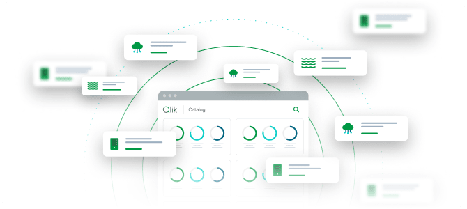
Visualizations you can trust at massive scale
Maintain confidence in visual insights with governance that tracks data lineage from source through visualization, ensuring every chart and dashboard reflects accurate, validated information.

Visualization capabilities that grow with your data
Scale visualization from thousands to millions of data points without performance degradation, using intelligent rendering and aggregation that maintains interactivity at big data scale.

Visual analytics for everyone, not just analysts
Create sophisticated visualizations through drag-and-drop interfaces or natural language requests that automatically generate appropriate charts without requiring visualization expertise.

Self-service visualization with enterprise control
Empower business users to create and customize dashboards independently while maintaining IT governance over data sources, security, and visualization standards.

Trusted for mission-critical big data visualization
Join organizations that visualize petabytes daily with Qlik, transforming complex big data into clear visual stories that drive strategic decisions and operational improvements.
Key capabilities of Qlik's big data visualization software

AI-powered workflows for automation at scale
Automate dashboard creation, insight generation, and visualization selection with AI that analyzes big data patterns and generates appropriate visual representations automatically.

Intelligent forecasting and predictive modeling
Visualize predictions and forecasts generated from big data with integrated predictive analytics that displays future trends alongside historical patterns in interactive charts.

Natural language queries and AI-generated SQL
Request visualizations in plain English and receive instant visual answers, with AI that understands context, queries big data sources, and generates appropriate visualizations automatically.

Visual data discovery with augmented analytics
Explore big data through interactive visualizations enhanced with AI suggestions that guide analysis, highlight outliers, and recommend relevant relationships to visualize.

Self-service dashboards and collaboration tools

Enterprise-grade governance and security
Protect visualized data with row-level security that dynamically filters dashboards based on user permissions while maintaining audit trails of who viewed which visualizations.
Trusted by leading enterprises worldwide


What our customers say


We started an automation process with Qlik and now we only have half the people managing reports. The other half is doing activities allowing us to leapfrog the competition by providing even more proactive analytics vs. reactive.


Connect to 500+ data sources with Qlik’s analytics integrations

SAP

Adobe

IBM

AWS

MySQL

Jira

Azure

MS SQL

Apache

Mongo DB
SAP
Adobe
IBM
AWS
MySQL
Jira
Azure
MS SQL
Apache
Mongo DB
SAP
Adobe
IBM
AWS
MySQL
Jira
Azure
MS SQL
Apache
Mongo DB
SAP
Adobe
IBM
AWS
MySQL
Jira
Azure
MS SQL
Apache
Mongo DB
SAP
Adobe
IBM
AWS
MySQL
Jira
Azure
MS SQL
Apache
Mongo DB

Oracle

Salesforce

Workday

Apache Iceberg

CircleCI

Zendesk

Snowflake

Databricks


OpenAI

Intuit
Oracle
Salesforce
Workday
Apache Iceberg
CircleCI
Zendesk
Snowflake
Databricks
OpenAI
Intuit
Oracle
Salesforce
Workday
Apache Iceberg
CircleCI
Zendesk
Snowflake
Databricks
OpenAI
Intuit
Oracle
Salesforce
Workday
Apache Iceberg
CircleCI
Zendesk
Snowflake
Databricks
OpenAI
Intuit
Oracle
Salesforce
Workday
Apache Iceberg
CircleCI
Zendesk
Snowflake
Databricks
OpenAI
Intuit
Resources


Big data visualization FAQs
Intelligent aggregation, progressive rendering, and in-memory processing work together to display big data visualizations with interactive performance through optimization techniques that maintain responsiveness.
Yes, extensible visualization frameworks enable custom chart development while built-in visualizations handle most big data scenarios including heat maps, network graphs, and geographic visualizations.
Dashboards can refresh automatically with streaming data or on-demand with batch updates, maintaining visualization state and user interactions while incorporating new big data.
Responsive dashboards adapt to desktop, tablet, and mobile devices with touch-optimized interactions that enable big data exploration anywhere through native apps or web browsers.