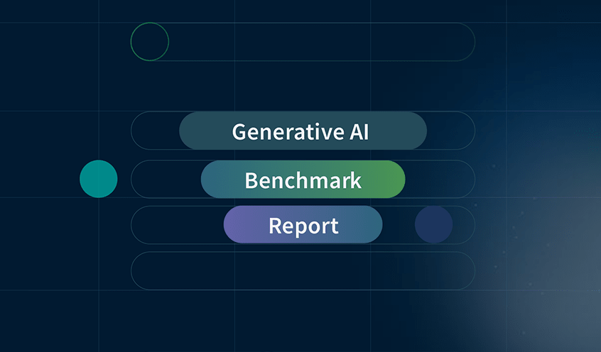


Key Features Comparison – The 3 Gartner Leaders
In their 2023 Magic Quadrant Analytics & BI report, Gartner named only three vendors as Leaders: Qlik, Power BI and Tableau. That’s because while most popular dashboard tools can produce charts and graphs of all shapes and sizes, best-in-class dashboard software does more than turn data into pretty pictures. Top dashboard tools also help all users explore their data from every angle in a scalable and governed way.
Here are the Top-10 Features to Compare the Best Dashboard Tools:
1. Dashboard Data Exploration
Many tools can make cool-looking dashboards. The best dashboard software allows users from across your organization to freely explore all your data, in any direction, directly from within the analytics dashboard. This way, teams can easily uncover insights they couldn’t find with query-based tools where they need help from the IT team to answer new questions.
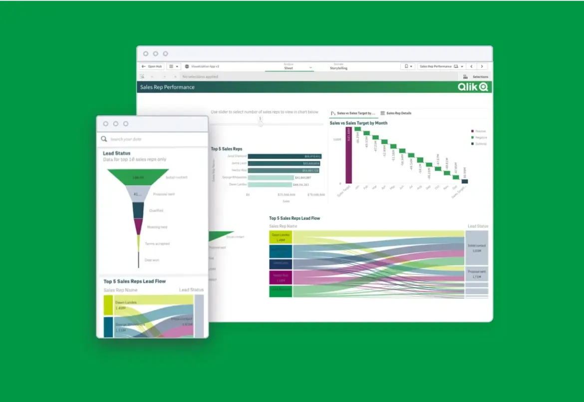
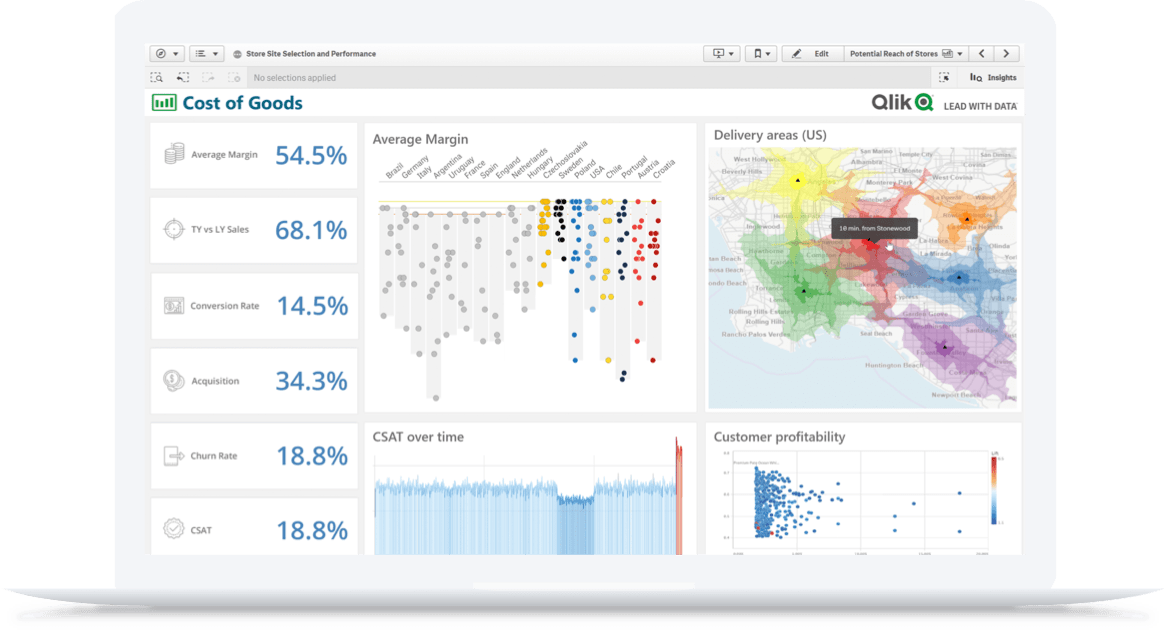
Qlik Sense
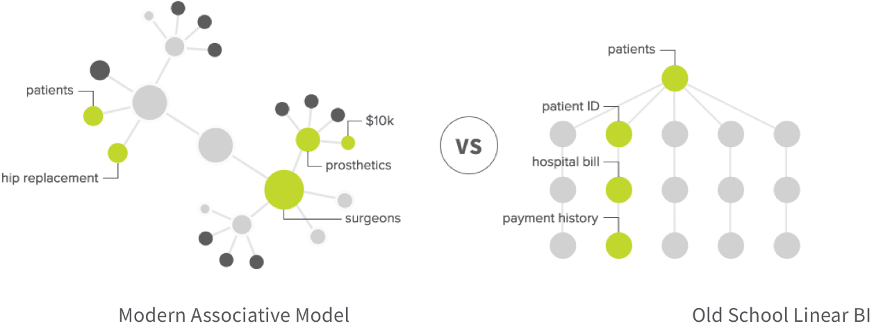
Qlik’s “associative” data engine gives users the ability to freely analyze all their data. Qlik also helps you know where to explore next with the help of its cognitive engine, which uses machine learning to refine results over time.
Tableau
Tableau uses a SQL database, which means users can only follow predefined paths within a small slice of data. As a result, only part of your data is analyzed, leaving many insights undiscovered.
Power BI
Power BI users are also restricted to a linear, predetermined path, as its BI dashboard software uses a SQL database.
2. Data Visualization
Again, lots of tools will let you create graphs, charts and maps. But modern dashboard tools go further by using AI to automatically suggest new visuals, reveal the shape of your data and pinpoint outliers. And they allow you to explore all your data, in any direction, from within the visualization.
Qlik Sense
Qlik provides the full range of interactive visualizations and makes them uniquely powerful by compressing large data sets. Qlik’s AI assistance also helps with chart creation, recommended associations, revealing the shape of your data and even data preparation.
Tableau
Tableau offers a full range of visualizations as well. After all, this is what Tableau is best known for. But as with their dashboards, you’ll only be able to filter and explore the visualization based on whatever query paths the author selected.
Power BI
Power BI also offers a full set of visualizations. These visualizations are interactive but you’ll be limited in filtering and exploration by whatever query paths were preselected by the author.
3. Easy Data Integration
Again, lots of tools will let you create graphs, charts and maps. But modern dashboard tools go further by using AI to automatically suggest new visuals, reveal the shape of your data and pinpoint outliers. And they allow you to explore all your data, in any direction, from within the visualization.

Qlik Sense
Qlik Sense has best-in-class Data Integration capabilities for combining and transforming data as well as data cataloging. Qlik also offers an enterprise class Data Integration platform which provides a seamless analytics data pipeline.
Tableau
Tableau offers two options for integrating data: Tableau Desktop and Tableau Prep. Each addresses different issues, and it’s difficult to know which tool to use for which problem.
Power BI
Power BI has several disconnected data integration offerings. That means you’ll have to invest more in the Microsoft stack for additional products to get the answers you need.
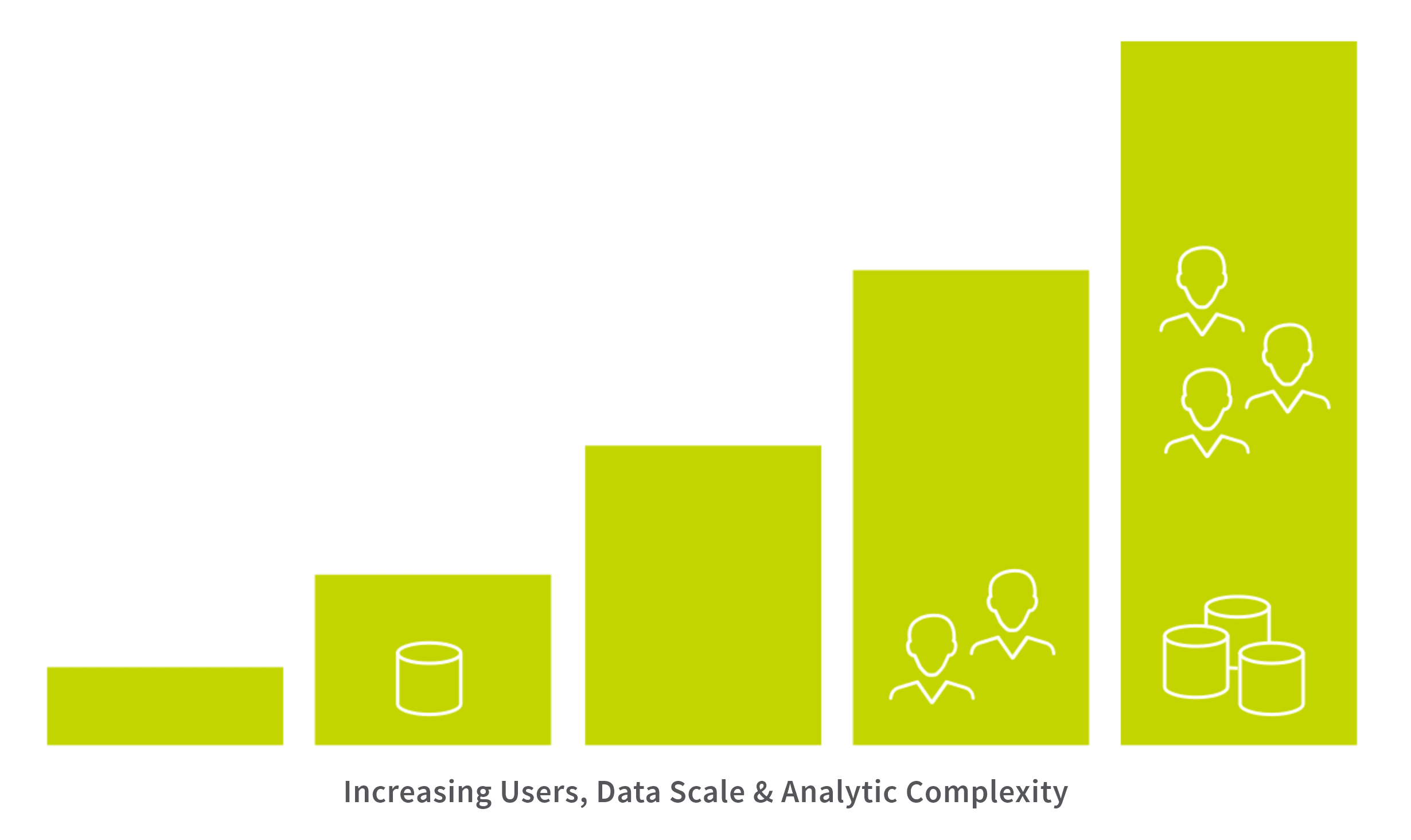
4. Insights at Scale
Your dashboard software should be able to process growing volumes of data without higher costs or negative impact on performance. That means being able to pull data from multiple sources so you can get more complete insights in near real time, no matter how much data you take in.
Qlik Sense
Qlik ingests large amounts of data quickly and gathers from multiple sources, giving you complete and immediate answers. You can also keep your data updated in smaller builds by editing, adding or removing records.
Tableau
Large amounts of disconnected data are hard for Tableau to process, and complex analytics degrades performance even more. The software also doesn’t allow you to increment data to keep it updated in small builds.
Power BI
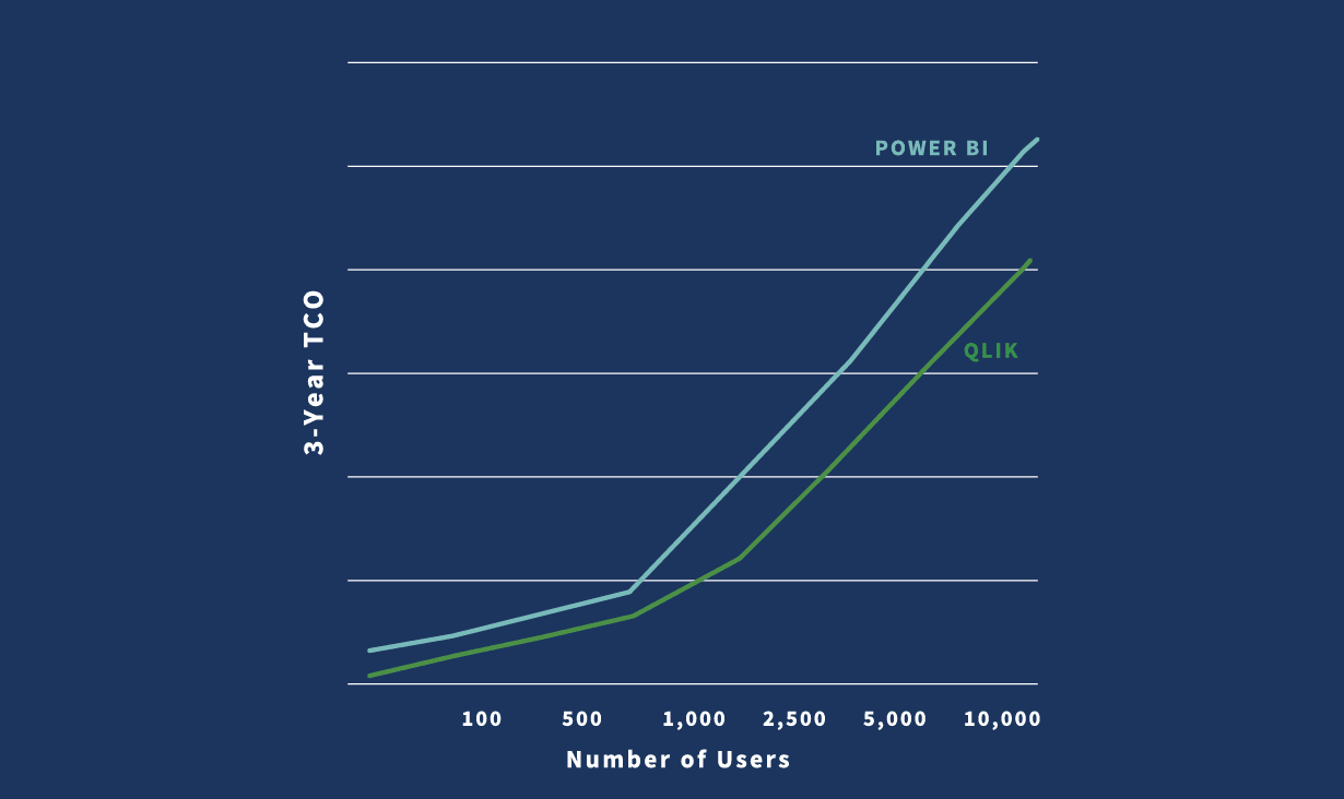
Power BI data limits are extremely low, at 1GB per data set. To scale, you’ll have to pay more to upgrade to Premium or use live query, which is slow.
5. Multiple Deployment Options
No matter which cloud architecture or platform you use, your dashboard software should be able to adapt, without requiring you to change your cloud analytics strategy, build new infrastructure or lock in your data.
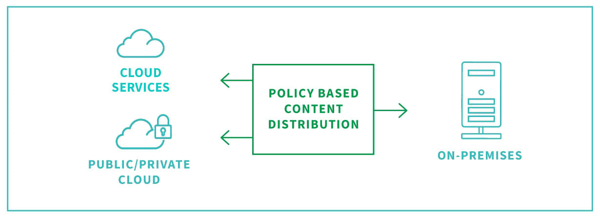
Qlik Sense
Qlik provides a full enterprise SaaS solution and on-premise or private cloud options. Plus, Qlik is independent, offering you total freedom and control of your data.
Tableau
Tableau is now part of Salesforce, which could leave you wondering where your data might end up, or worrying about data lock-in.
Power BI
Power BI only runs on one cloud solution: Microsoft Azure. What’s more, cloud and on-premise experiences aren’t consistent.
6. Governance and Self-Service
Give users the freedom to investigate their data using self-serve BI, with the security of rules-based governance. With this balance, the best dashboard reporting software empowers users to create their own insights without the help of an analyst or IT.

Qlik Sense
Qlik centralizes and unifies your data, creating governed data models with robust data security. All content creation on Qlik happens in the cloud, where it’s governed and controlled. Plus, governed libraries provide reuse and standardization for analytics.
Tableau
Tableau allows for multiple copies of content with only minor iterations. You’ll have to invest time and money to manage these different copies.
Power BI
With Power BI, data is decentralized, spreading it across both the cloud and user desktops. This makes data management and validation difficult.
7. AI-Guided Discovery
Boost productivity and make better decisions with the help of AI and machine learning. Best-in-class dashboard software does more than just help you visualize your data. Using augmented analytics, a dashboard reporting tool helps you dig deeper into your data, and discover insights from unique angles.
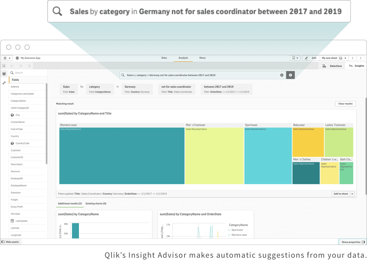
Qlik Sense
Use natural language to ask a question in Qlik and get answers to guide your exploration. Qlik gives suggestions along the way, giving you new and different ways to analyze your data.
Tableau
To get value from insights, you need to connect to business logic built into workbooks. Tableau users can’t do this, as its Ask Data feature can only connect to data sources.
Power BI
Quick Insights and Q&A are two features in Power BI that use AI. With Q&A, you can analyze with natural language. Quick Insights lets you explore using shortcuts.
8. Embedded Dashboards
The best dashboard software gives employees, customers, partners and suppliers the ability to work with visual data in applications they use regularly. Embedded analytics, also called white label analytics or OEM, gives users access to portals and processes, speeding up decisions. Analytics dashboard software should allow you to embed analytics across the business with a flexible platform and open APIs.
Qlik Sense
With Qlik, you can use APIs to integrate technologies like edge devices, workflows, products and portals. This allows you to embed a fully functional dashboard into your mobile app, including individual values.
Tableau
Tableau’s API offerings are quite limited. For instance, rather than embedding individual values, you can only embed a full dashboard.
Power BI
While you can embed dashboards and objects in PowerBI, it doesn’t provide strong API functionality, and their SDKs provide limited capabilities.
9. Full Mobile Functionality
It’s important that users have access to BI dashboard software no matter which device they use. Empower them to explore and analyze with a mobile app that provides full functionality, allowing users to get the insights they need, anywhere they are.
Qlik Sense
Qlik Sense is built for mobility. The full-native mobile app provides all the functionality users need, thanks to responsive design and touch, which are native to the platform.
Tableau
Tableau limits mobile users to simple features like downloading one workbook sheet. It also limits what users can do. Rather than filtering, users have to highlight a value and manually find it in the displayed charts.
Power BI
Power BI users can only get the most from their data using a desktop and multiple software programs. You can use the cloud to upload reports, but with limited capabilities to perform edits.
10. Data Literacy Support
Data literacy means understanding how to explore and communicate visual data stories. The best dashboard software gives people what they need to discover their own insights, promoting data literacy across the business.

Qlik Sense
Qlik’s self-service tool gives users the confidence they need to easily discover insights, including the ability to drag-and-drop to create their own reports. Qlik also provides data literacy as a service, which brings together training, technology and processes.
Tableau
Tableau only supports data literacy for authors. That means if you’re any other type of user, you’ll be left behind.
Power BI
Only authors can access Power BI’s self-service option, with limited options for other users to shape their data. If business users want something more, they’ll have to ask the author for help.